The LaLiga teams that changed their emblem in the 21st century
Last update 19 November, 2022 por Alberto Llopis
¿Quiénes son los LaLiga teams that changed their emblem in the 21st century? The symbol of the institution, the identity of a team, the seal burned into each player, technical and fan staff: The shield. A distinctive flag of each club that reminds the entire packed stadium of the colors they defend. Something that seems immovable because of the feeling it carries, but it is not.
In recent years we have witnessed the change of shield for logos of international teams such as Manchester City, Juventus, PSG, West Ham, Milan or Bayern Munich. Entities that understood that in order to evolve, mark a before and after, a facelift was needed. Las plantillas, technicians, the fields... were being renewed, why not the emblems.
This is how, with the beginning of the 21st century, home teams began to modify their shields.. Sin embargo, These modifications had to be minimal with respect to the previous distinctive, since branding experts contemplate a reaction of rejection on the part of fans of shields that suffer significant alterations. Small touches that will mark a new beginning, but that allow us to maintain the essence, be welcomed and not seen as disrespectful to their history and traditions.
The LaLiga teams that changed their emblem in the 21st century
Real Madrid and FC Barcelona
Con la llegada de los 2000 the first changes begin in Spain. The pioneers would be Real Madrid and Fútbol Club Barcelona.
The Catalans switched to the current form of the shield in the year 2002. They did it with a design by Claret Serrahima, who opted for more stylized lines, removed the periods that separated the initials, shortened the name and reduced the number of outgoings. This new format with a simpler silhouette makes it easier to reproduce the entity's corporate identity.
Por otra parte, those in the capital begin the model of change in the 2001, when the shield tries to adapt to new times, but it's not until the season 2003/2004 when it becomes official. This new emblem, which has the letters expanding and changes to blue in the central strip, comes after the accumulation of two Leagues (00/01 y 02/03), dos Champions League (2000 y 2002), two Super Cups in Spain (2001 y 2003), one European Super Cup (2002) and an Intercontinental Cup (2002).A record that leads the merengue board to converge all these titles in a single shield, with the aim of positioning itself as a modern corporate brand before the world.
CA Health
Osasuna was the next to change its logo. En la temporada 99/00 The rojillo team returned to the First Division in a match against Recreativo de Huelva, in which the Andalusians risked losing their category. The Navarrese ended up winning and touching the sky once again by returning to the first division. They were maintained during the following courses between 20 best spanish teams, so they saw the time to introduce modifications. The central stripe colored in sky blue became white, the blue and red colors darkened a little, the letters became smaller, the most imposing lion and for the first time in the club's history the crown no longer appeared linked to the body of the shield but appeared suspended above it.
With this new emblem, just a year later (11 de junio de 2005), The team plays its first Copa del Rey final against Real Betis Balompié. A match that the Andalusians ended up winning in extra time and which proclaimed them runners-up. Además, in that same course, 05/06, They presented their best performance, finishing fourth in LaLiga, matching the season 90/91. It seems that the beginnings of this new shield brought them luck.
RCD Espanyol
Along its history, RCD Espanyol has had a total of seven different shields, the last one collected is that of 2005. It has been in force since December of that same year and presents several evolutions with respect to the previous Pere Durán model.: The stripes turned a brighter blue and the letters turned yellow. That same season, 05/06, The parakeets competed in the UEFA Cup for the second time and reached the final .
Cádiz CF
En la temporada 08/09 The Andalusians take first place in the Second Division B, a status that encourages the change of distinctive. This is how the last modification of the shield is produced until today, in which a design practically identical to that of the 2006, but more stylized. The rest, the central part with the figure of Hercules flanked by the two lions and supported by two columns, the inverted isosceles triangle (half yellow and half blue) and the ducal crown, it keeps.
Villarreal CF
Villarreal is a team of customs and has practically maintained the same shield since 1969. From that time to the following modification that is made in 1995 The only change there is is a linear simplification of the crown, while in the subsequent retouching of 2009 nothing changes, just the tone of the colors, that becomes a little more sober and subdued to fit into the new direction that LaLiga was taking.
Levante OUT
He 17 de junio de 2010 Levante Unión Deportiva announces the new renewed image of its shield in commemoration of its return to the First Division. A new, simpler design that can be adapted more easily to different formats and media.
En su momento, the president of Levante UD, Quico Catalán explained that the objective was not to break with the previous, but to stylize and normalize to the times. To achieve this, a design of Hector Conesa, which also captured the new centenary brand, that would honor the past and project the future.
Real Club Celta de Vigo
The Real Club Celta de Vigo is one of the teams in the current competition that has modified its shield the most throughout history, 20. The last time to do it was in 2010, when he chose to stylize the previous design, modified just a year ago, and put a brighter red for the first time. Shield heraldry: “In a field of azure, double silver border open to the left which are the initials of the Celta Club. to the shield, It has the Cross of Santiago gules attached. at the bell, royal enclosed crown of gold and pebbled, with eight florets, visible five”.
Real Betis Balompié
The emblem of the Beticos has changed twice throughout the 21st century. The last one did it in 2012, when Betis returned to the first division and the club, trained by Pepe Mel, proposes a new shield model to reinforce this new stage. In it you can see the two B's in green surrounded by a smaller circle and a more voluminous crown. Roughly, The design is a linearly simplified copy of that of 2002.
Valencia CF
Valencia began the new century with a renewal of the shield in 2001. A more ornate design with a bat full of details similar to the old ones from 1921 y 1919. Sin embargo, 11 Years later he proposed another change with the same objective as the rest of the teams: simplify the lines to adapt to the new modern model.
This drawing of 2012 offers, as we are used to, an opaque black bat and some stripes with a more vivid tone. The change coincided with the non-renewal of Unai Emery after four seasons and Mauricio Pellegrino becomes the new coach, appointed by hand and without having the opinion of the sports management or the board of directors. A change that, unlike the shield, It didn't suit him at all.
Rayo Vallecano
Since the beginning of the 2000 Rayo Vallecano has undergone two transformations. The first would be in 2009 where the design is maintained except for the sizes, which become much larger in proportion, from V, that turns red, and from the edge, that becomes lighter in tone. The second would be in 2012, when you completely return to the design of 1995 except for the ocher color that had taken the edge three years ago.
This era is characterized by being very fruitful and full of new talents.. Players like Dani Pacheco join the squad, Botelho, Raul Tamudo, Michu, after hours, Labaka o Sergio “Boil” Contreras, that thanks to their beautiful attacking football they achieved 8th position with 53 points, this is becoming the best season (both in points and ranking) of the team's history.
Elche CF
Desde 1929 The Ilicitanos shield has been based on the municipal shield of Elche and has maintained its three horizontally differentiated parts.. So far this century it has been modified twice, en el 2009 y 2012. In the latter the colors have become more sober, the shield has become wider, with more spaced letters and drawings, and the designs of the Roman matron and the monuments are more simplified.
En la temporada 12/13, the franjiverdes were proclaimed winter champions and achieved, four days before the end of the league, achieve a return to the First Division of Spain. Something they would achieve after 24 years since their last participation in the top category.
Deportivo Alavés
But if there is a team that has changed its shield on numerous occasions, that's him Deportivo Alavés. Those from Vitoria have modified their emblem on four occasions, 2001,2009,2013 y 2020, the latter being the most controversial.
En 2020, the club abandoned the symbolism of the flag, which until now was the main part of the shield, to focus on the surroundings. The circle that had been encompassing the banner jumped from the background to the protagonist, thus becoming a completely round shape where you can read “Sports” at the top., and in the lower one “Alavés”, while in the center the classic flag appears. Everything with a more modern touch, thanks to the certain degree of waving of the insignia and the chromatic unification in blue.
The reason for the change was the simplest and most repeated throughout the history of the teams, the commemoration of 100 club anniversary.
Getafe CF
Since his training in 1983, Getafe CF has only changed its shield on five occasions, three of them this century (2003, 2011 y 2013). Like Elche, and many other teams, The club's official emblem is an adaptation of the town's emblem, adding a blue ring embracing it with the team's name and crowning it with a soccer ball..
Its last modification was in the season 13/14, on the occasion of the commemoration of the tenth season in the 1st Division, which incorporates a golden beam or flash around the entire shield..
Atletico Madrid
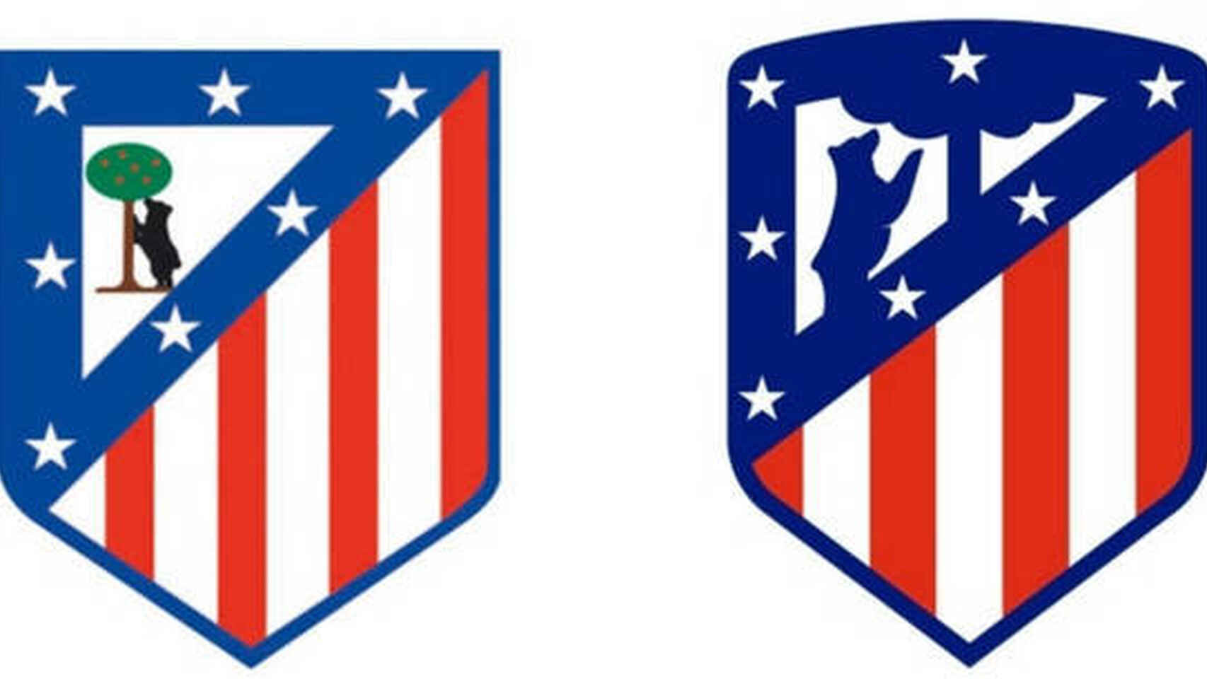
In their 118 years the shield has changed six times and only once in the 21st century. This change occurred in December 2016 when, taking advantage of the event in which the name of the new stadium would be announced, Wanda Metropolitano, surprise announced the renewal of the emblem. The main touch-up that would be done would be the color.. The shield became two-color, being, apart from white, all in blue and red and thus abandoning the characteristic green strawberry tree with fruits.
Granada
After six seasons in the top category, Granada is mathematically relegated to the Second Division in 2017. But far from giving up, The entity proposes a 180º turn with the appointment of a new sports director, a new CEO, a new director of youth football, a new technical secretary, a new honorary president of the club and a renewal of the shield in order to return Granada to the elite as soon as possible.
The adjustments made to it to make it more practical and visual when fitting it into the different supports are based mainly on the thickness of the lines and the transformation of the fruit.. A food that has been in constant metamorphosis since the birth of the club and that this time appears rounder without stem or leaves, previously found design.

